An annual report is more than simply a financial document; it allows organisations to highlight their accomplishments, values, and future goals to stakeholders. However, badly designed annual reports might reduce their usefulness and fail to interest readers. Creating a great annual report involves meticulous preparation, design expertise, and attention to detail. Partnering with an annual report design company may assist in guaranteeing that your report is visually beautiful, engaging, and consistent with your corporate identity. In this post, we’ll go over the dos and don’ts of Annual Report Design so you can develop a document that successfully delivers your message and matches your brand identity.
Dos of Annual Report Design
1. Prioritise Clarity & Readability
Do: Make your annual report easy to read and understand. Use clear and readable typefaces, proper font sizes, and enough of white space to increase readability.
2. Do Use Consistent Branding
To strengthen your organisation’s identity, use consistent branding throughout your annual report. Use consistent colours, typefaces, and artwork that adhere to your brand requirements.
3. Do Incorporate Visual Elements
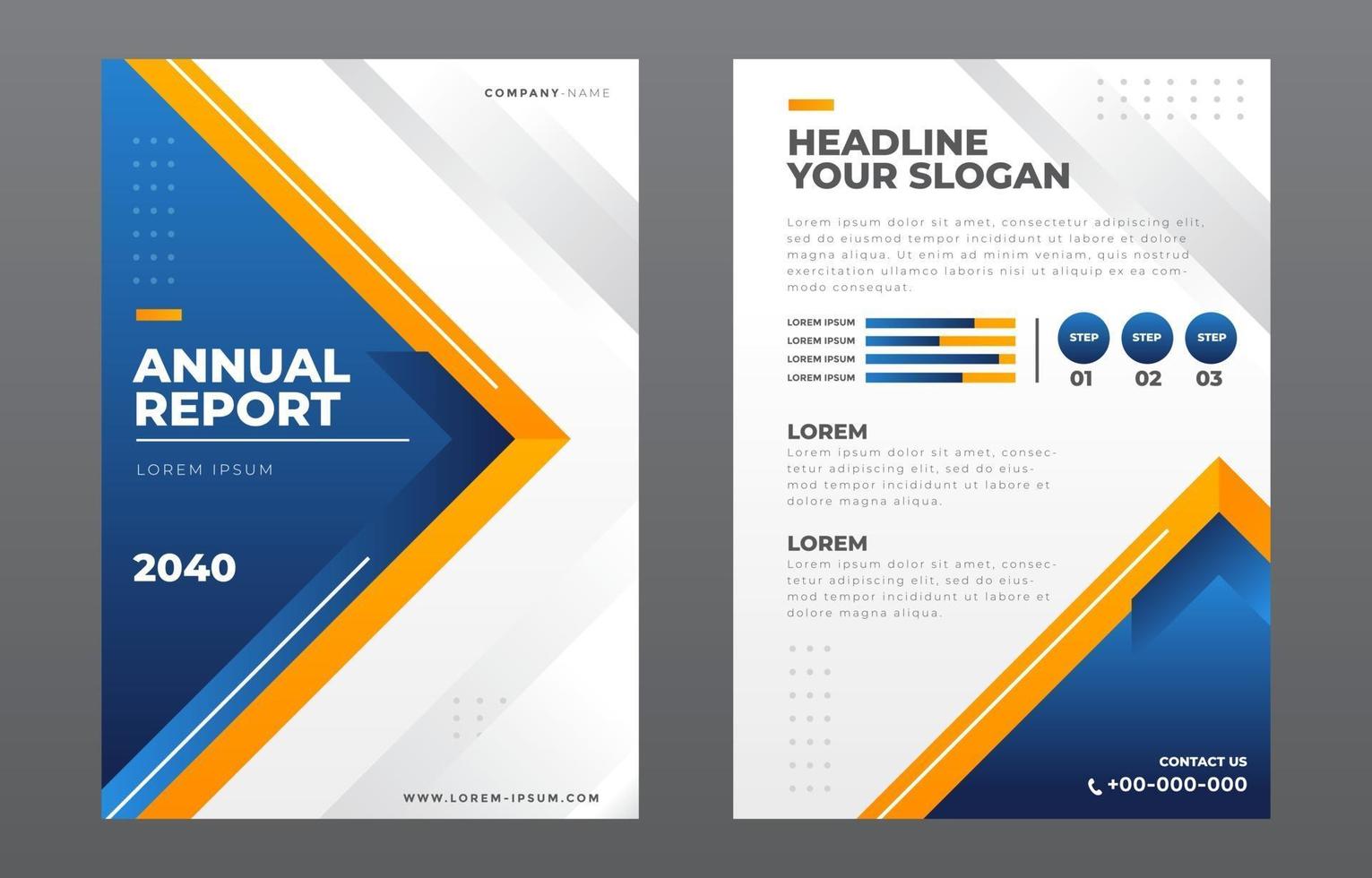
Use visuals like charts, graphs, infographics, and images to break up the text and make the report more interesting. Visual components help express complicated ideas more effectively.
4. Do Tell a Story
Create an annual report that consistently and captivatingly tells the story of your organisation’s performance and accomplishments over the previous year. Engage readers by providing tales and anecdotes that bring your facts to life.
5. Do Provide Context
Help stakeholders comprehend the value of your data and insights. Explain the significance of the data and how they relate to your organisation’s aims and objectives.
Don’ts of Annual Report Design
1. Don’t Use Too Much Text
Avoid using too much language in your yearly report. Long paragraphs and dense blocks of text can overwhelm readers and make it harder for them to retain information.
2. Don’t Ignore Visual Hierarchy
In your yearly report design, ignore the visual hierarchy. Instead, use headers, subheadings, and layouts to direct readers’ attention and highlight important topics.
3. Don’t Use Low-Quality Images
Do not include low-quality or pixelated photographs in your annual report. High-quality photos serve to maintain the document’s professional appearance and improve its overall visual appeal.
4. Don’t Sacrifice Accessibility
Do not sacrifice accessibility for design beauty. Make your annual report accessible to all stakeholders, including those with visual impairments, by incorporating alt text for photos and text versions of visual material.
5. Don’t Forget the Call to Action
Remember to add a clear call to action in your yearly report. A call to action, whether urging stakeholders to visit your website, join a mailing list, or participate in forthcoming events, engages readers and motivates them to act.
Conclusion
By adhering to these dos and don’ts of annual report design, you can build a document that successfully conveys your organisation’s successes and goals while engaging stakeholders. Avoiding common design blunders and applying best practices can help you develop an annual report that makes a good impression and builds trust in your organisation. Working with an annual report design business may improve the quality and impact of your report, ensuring that it provides the most value to your stakeholders.